Showing posts with label Tuesday Twins. Show all posts
Tuesday, September 14, 2010
Tuesday Twins
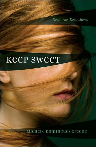
I stumbled across the cover for Keep Sweet by Michele Dominquez Greene while I was browsing on the Barnes & Noble website and was instantly reminded of Blindsided by Priscilla Cummings. The similarity of these covers' set-ups is striking - the girl with hair blowing across her face and the title covering her eyes. The coloring and text is quite different, but the designs just kind of jumped out at me.
What do you think? And have you seen any "twin" covers that just jumped out at you like that? Let me know! :)
Labels:
Tuesday Twins
Tuesday, August 17, 2010
Tuesday Twins
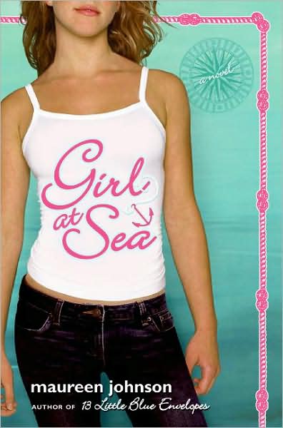
The covers of Girl at Sea by Maureen Johnson and Wish You Were Here by Catherine Clark just remind me so much of each other. I confess that I have not actually read either of this books but every time I see the cover of one I think of the other one. They're not super-identical or anything...just very similar:
With the faces cut off just below the eyes, the bluish backgrounds, the titles that call up images of travel, the placement of the authors' names and "Author of..." statements, even the outfits aren't terribly different (they both have dark jeans and have their weight on one leg). Oh, and the titles are both pink and in similar places, and the hair is blondish.
What do you guys think? And if you spot any twin covers that you think I should feature here, let me know!
Labels:
Tuesday Twins
Tuesday, July 27, 2010
Tuesday Twins
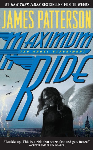
I think the girl on these covers must be a stock photo: the original cover of Maximum Ride: The Angel Experiment by James Patterson, and Kindred by Tammar Stein.
That aside, there's not a whole lot of similarity in the covers; the Maximum Ride book (the original cover, mind, not the new ones with Max & Co. in battle - this is the one I have) has a lightning-y cityscape that basically says "action!" while Kindred looks a little more laid-back and chill. But I'm pretty sure that is the same girl.
Personally, I'm partial to the Maximum Ride cover, but that may just be because I haven't read Kindred but I have read and loved the Max Ride books. What do you guys think?
Labels:
Tuesday Twins
Tuesday, July 20, 2010
Tuesday Twins
This week's covers are distinct enough that no one's going to be getting them mixed up, but they're still strikingly similar in their cover image: Forget You by Jennifer Echols and Spirit Bound by Richelle Mead.
These two covers are blatantly different in a lot of ways; Forget You looks like a summer beach read and Spirit Bound, maybe because I'm so familiar with the series, looks like a paranormal romance; the text is different (no caps vs. all caps); the backgrounds are different (beach backdrop vs. solid color with VA series gate). But the image of the not-quite-kissing couple (although the male/female models are on opposite sides) and the sort-of-pinkish/skin-toned color schemes, plus the darker-haired-guy-and-lighter-haired-girl thing, sort of connects these covers for me. What do you guys think?
Labels:
Tuesday Twins
Tuesday, July 13, 2010
Tuesday Twins
I cannot count how many times I've heard people say that a book's cover is its most important marketing technique. Book covers are important. That in mind, I know a lot of bloggers have cover-comparison features (such as Pop Culture Junkie's Lookalikes and Hooked on YA Books' Cover-Compare Fridays), but I love covers too, so I'm going to jump on the bandwagon.
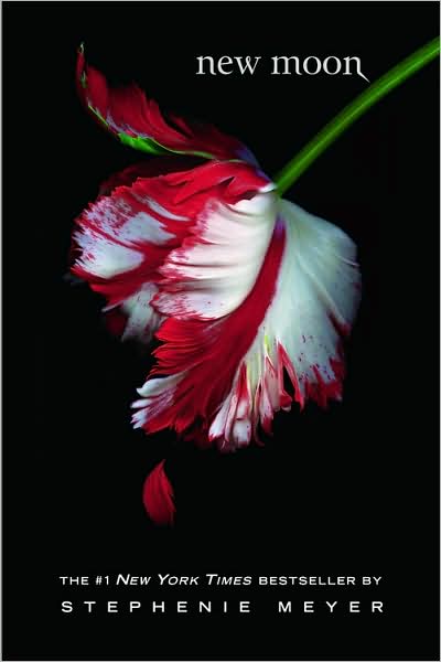
So, we all know that Twilight is a huge deal right now. Even if we do feel like vampires are getting incredibly overdone right now, there's no denying that Twilight is popular and it sells. We see the black cover with the red and/or white image and that's just what we think of. The whole series is that way. Red-and-white flowers on a black background are associated with the New Moon cover, period, end of story.

So, we all know that Twilight is a huge deal right now. Even if we do feel like vampires are getting incredibly overdone right now, there's no denying that Twilight is popular and it sells. We see the black cover with the red and/or white image and that's just what we think of. The whole series is that way. Red-and-white flowers on a black background are associated with the New Moon cover, period, end of story.
But even knowing that, I still got rather upset when I saw the new covers for Romeo and Juliet, Pride and Prejudice, and Wuthering Heights in my local Barnes & Noble:

I mean, the way these four covers look, they could be a series. The black backgrounds with red-and-white flowers and a trace of green in the stalks; the curlicue script for the titles; the spaced-out capital letters spelling out the authors' names...never mind that they were all written at different times by different people, these covers make them look like they simply belong together. The Wuthering Heights cover even mentions Bella and Edward!
I have to admit, the cover designers did a good job of it; I'm quite sure the covers were meant to resemble New Moon, and they do that well. And the covers are pretty, too! Not sure how well the roses represent Pride and Prejudice, but I do think that cover especially is really nice-looking. But it still makes me a little sad that someone might assume Pride and Prejudice to be a young-adult vampire romance novel just because of the cover. (If you didn't know or hadn't guessed, I really love Pride and Prejudice.)
What do you guys think of the new covers for these classics? Yay or nay?
Labels:
Tuesday Twins
Subscribe to:
Posts (Atom)